Every new retailer meant starting from zero
SupplyPike's deductions product served dozens of retailers, with 10 to 30 more expected to come online in the next few years. That kind of growth is a good problem to have, but it was outpacing how the team actually worked in Figma. Each existing retailer app had been designed and built independently: no shared components, no shared patterns, just whatever the team building it decided on at the time.
That independence hadn't mattered much at a smaller scale, but at the pace we were onboarding new retailers, it became the real constraint. Workflow tabs, status definitions, and detail-page layouts all diverged slightly from retailer to retailer, even when the underlying logic was identical. Every new retailer meant redesigning and rebuilding UI that already existed somewhere else in the product. The fix wasn't just about UI consistency. It was about rethinking how we worked in Figma so a new retailer could get stood up fast, without starting from scratch.
An audit before an opinion
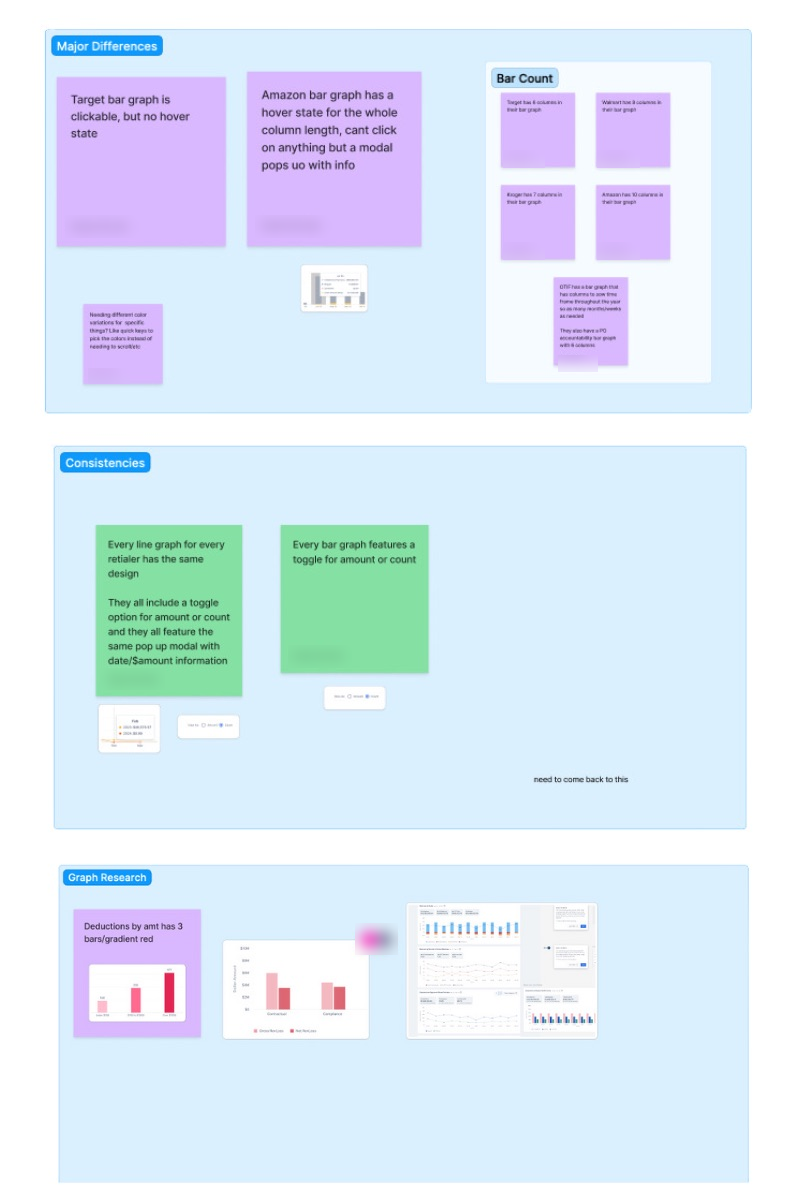
Before proposing a system, I audited what was actually in production: every component across every live retailer app, compared side by side. Graph components alone told the story on their own — column counts, hover behavior, and click interactions had each drifted independently across retailers, with no one having decided that on purpose.
The audit also surfaced the opposite pattern: places where every team had converged on the exact same solution without any shared documentation forcing them to. A toggle between amount and count, the same pop-up modal shape for date and dollar detail. These weren't accidents. They were the same problem being solved the same way, over and over, from scratch, every time.
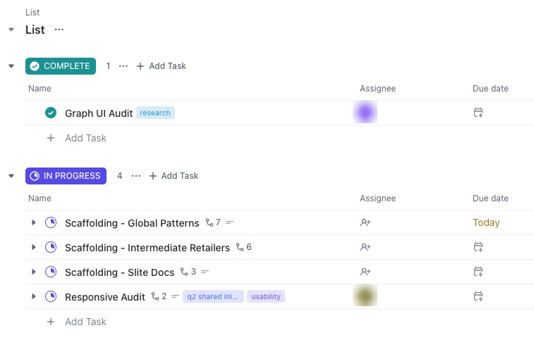
The findings came out of a genuinely collaborative process: working sessions with engineers, product managers, and the rest of the UX team, tracked and prioritized in ClickUp as a formal project rather than a side effort. That structure mattered. It meant audit findings turned into a scoped, sequenced body of work instead of a wish list.
A component library that documents itself
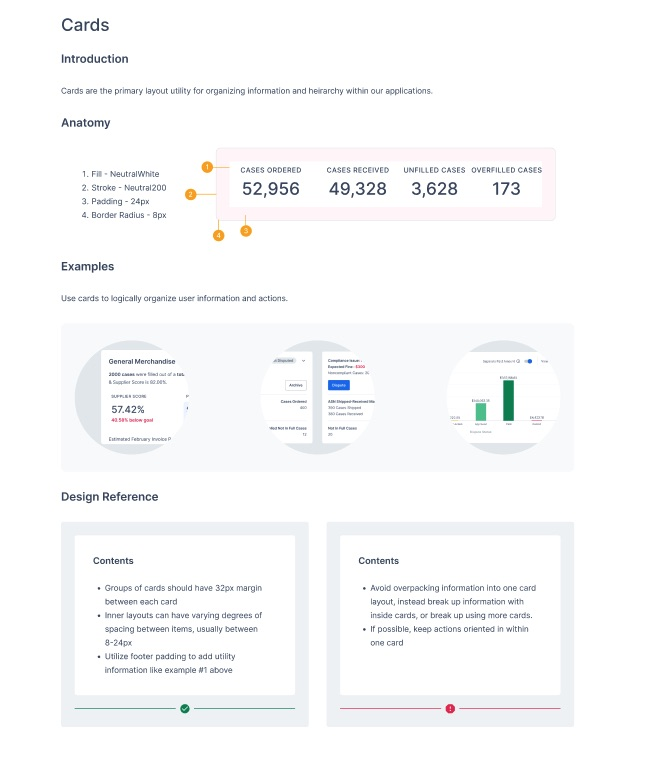
The output wasn't just a Figma file of components. It was documentation built to be used by people who didn't build it. Every component ships with its anatomy labeled directly on the design (fill, stroke, padding, border radius), real usage examples, and explicit design-reference guidance on when to use it and when not to.
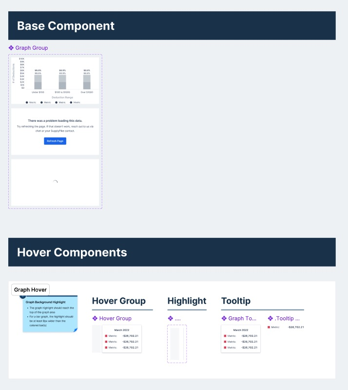
The graph component was the deepest case. I broke it into a base component with its own loading and error states, plus a separate layer of hover components (hover group, highlight, and tooltip) that could be composed independently instead of duplicated inside every graph variant.
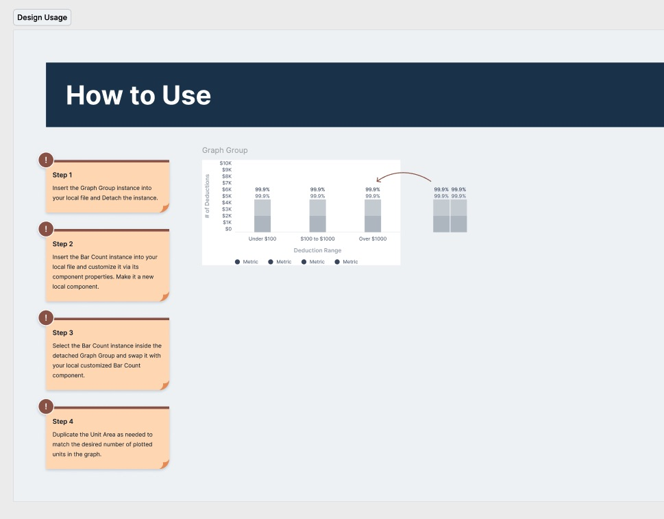
Documentation only works if a team that's never touched the file can pick it up cold, so every component that needed customization shipped with numbered how-to-use steps: detach the instance, customize it locally, swap in the pieces that need to change, duplicate what needs duplicating. No guessing at intent.
Where it landed
Components audited and documented across every live retailer app.
New components added to the shared design system as a result of the audit.
Reduction in the number of non-scalable component updates going forward.
By the time I left, the library and template system had become the starting point for every new retailer build, not an optional reference. What used to mean redesigning a detail page from scratch became forking a template that already had the core patterns built in.
What I'd do differently
If I ran the audit again, I'd loop engineering in from day one instead of bringing them in once the component list was already drafted. Some of the "inconsistencies" I flagged turned out to be intentional technical constraints, not oversights, and I only found that out after the fact. The earlier that conversation happens, the less gets redone.